In Living Color
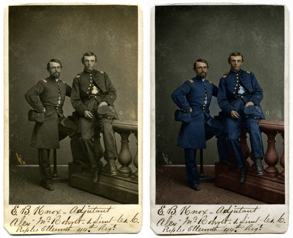
I am a purist by nature and by training as a visual journalist. For these reasons, the thought of colorizing images instantly strikes me in a negative tone. However, when I reflect on the many Civil War period photographers who tinted cartes de visite, or employed colorists to artfully add a bit of pigment to enhance a black and white image, my gut instinct is challenged. Moreover, when I consider the value of examining images from different perspectives, and realizing the power of modern technology (in this case, scanners and Photoshop), my curiosity is aroused. What did these soldiers look like in living color? We'll never see these men exactly how they appeared. But, thanks to Photoshop, as shown here in this carte de visite of Maj. Edward Burgin Knox (left) and Capt. Alexander McRoberts of the Fourty-fourth New York Infantry, we can get an idea of what they might have really looked like.
Labels: 44th, alexander mcroberts, center for civil war photography, colorist, edward burgin knox, forty-fourth, infanty, new york, photographer, photoshop, scanner, tint
posted by Ron Coddington at 8:05 AM
![]()
![]()


5 Comments:
As a designer I can appreciate the traditional black/white photo, but I can agree that the addition of color certainly adds a new dimension to these old photos. I especially like the colorization you did on the Abraham Lincoln photo back in February.
I wonder what Brady, Gardner or O'Sullivan would have thought if they had the technology for color photography back in the day. And I wonder if our modern perceptions of the war would have changed due to color. I think many people don't understand the impact color (or the lack of) can really make in photography until you see it both ways.
I thought the colorization of these images of the dead at Gettysburg were very well done and quite striking.
http://www.gdg.org/Research/Authored%20Items/Colorized.htm
Are there any Photoshop secrets you can divulge on your tinting technique (like how you keep your contrast level up when so many of the cartes de visites are very flat in their tone?
I am reminded by your comment that photographers of that time where as much technologists and scientists as they were artists, and that they would likely be as adaptive and progressive in today's media landscape as they were then.
My Photoshop tinting technique relies on Image/Adjustments/Variations, which allows me to control the combination and amount of color.
The color is applied by using Eliptical Marquee Tool and the Pen Tool (using Paths). All shapes drawn with this tools are feathered, the radius depending upon the image area selected.
At various points along the way, I use Image/Adjustments/Hue/Saturation to increase or decrease the overall color, and rely on the darken and lighten options in Variations for contrast.
I start by making the entire image sepia-toned (using Variations to add yellow and red). Then, I select areas with the Marqee or Pen Tools and begin adding tints, layering them until I've achieved a natural look. I finish by applying a tint over the entire image (depending upon the subject, the color can be warm sepias to cool blues) to unify all the tints.
That's the technical side. The creative side is key, and my training as an artist plays a major role. For example, when working with faces, I add a light blue tint to the soldier's chin and lower cheeks (where his beard grows) and a red tint to his forehead, nose and ears (where he is likely to get more exposure from the sun). Also, I take care to add a red tint to the corners of his eyes, and add a light blue to his eye sockets to emphasize the depression in the skull.
I try not to over-tint, which makes an image look unnatural. I've found that modest tinting provides the most realistic result.
Ron, first comment although a regular reader.
I do consider myself a purist but that colorization job was simply amazing.
Thanks for posting.
Ron, do you know of any good book that deals with learning colorization techniques?
Revisiting your post got me thinking on learning the 'art' so maybe I can start working on some of my images as a side hobby.
Their are a number of books that teach the technical aspects of painting in Photoshop. Learning when, where and how to apply the color is the more complicated aspect, and, for that, I look to the old masters. As a general rule, less is more. A little bit of color goes a long way!
Post a Comment
<< Home